Use Dot Density Styles to help Visualize Area Features
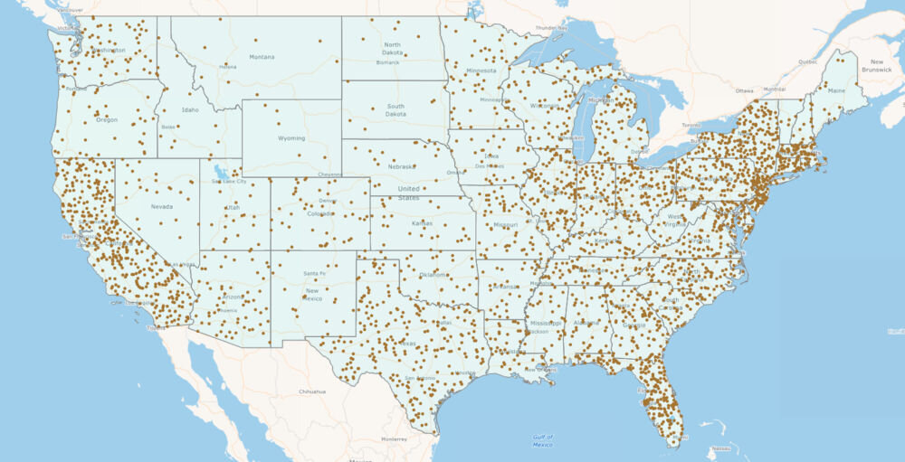
Map Suite gives you a number of styles to create thematic maps to convey your message. One of these is the dot density style which allows you to arbitrarily set dots in proportion to attribute data associated with an area. This is a simple and effective way to display your data.
Dot Density styles can only be used on area based feature layers such as Countries, States, Counties, etc. The number of dots can be based on a value in the feature data, for example you can use population so the areas with the highest population have the most dots.
The PointToValueRatio property allows developers to control the number of dots to be displayed e.g., you set 100,000 in this property it would show 10 dots for a state with a population of 1 million. In addition, users can easily control the color and point size.
View the online Dot Density – US Population demo here. To quickly get started access the code samples and API documentation.