Data Visualization

Styling Your Maps
ThinkGeo provides many options for styling maps. If you don’t find what you need, it’s easy to extend our existing styles or even create one from scratch. At its base, there are three basic types of styles, not including labeling which is covered in another section. These are outlined below and are flexible in creating great looking maps.
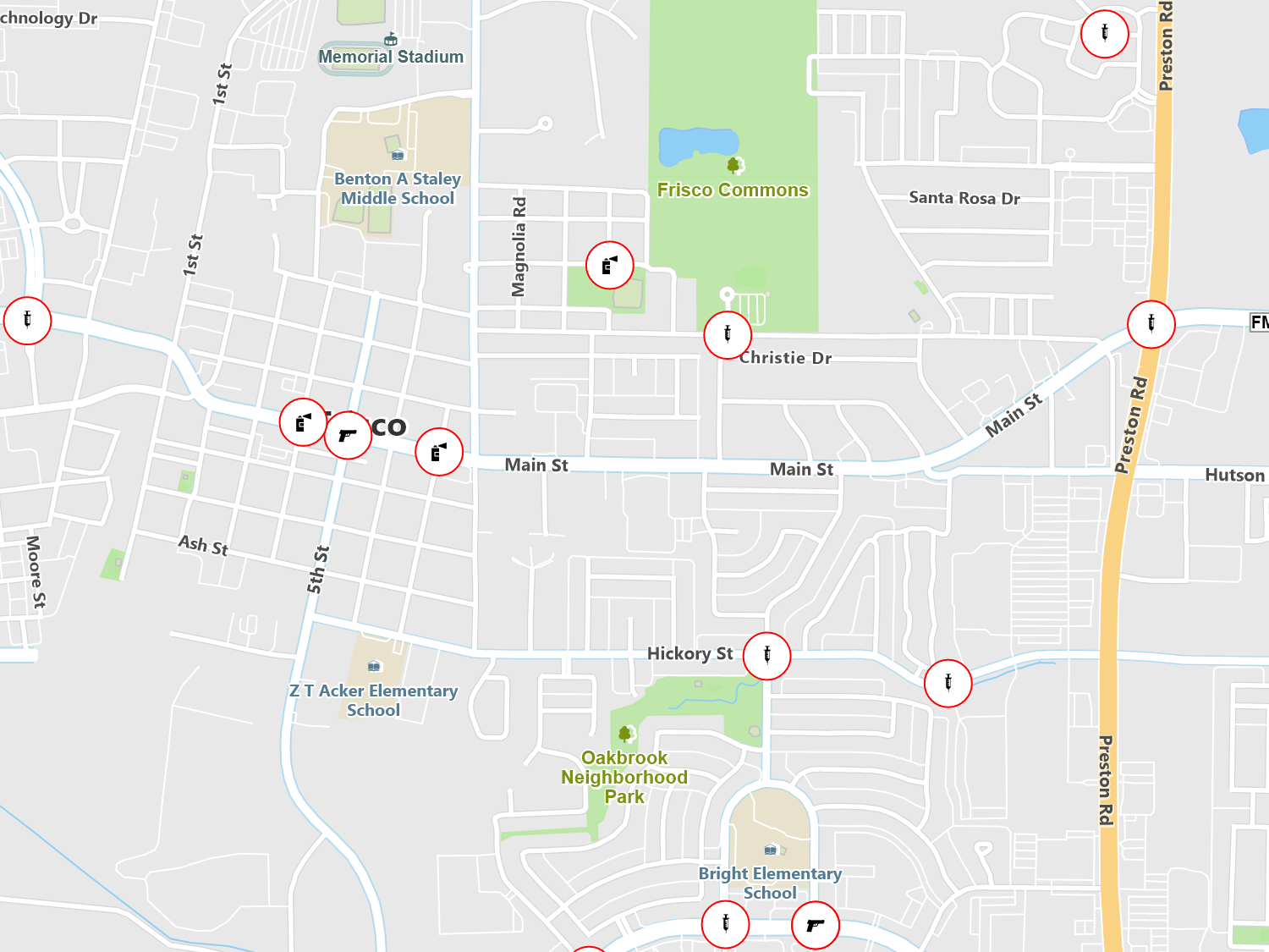
Points - Includes support for icons, fonts and simple symbols as well as PNG images and custom drawn symbols.
Lines - Choose the thickness, end cap design, dash pattern as well as many other options. Lines can also be stacked on top of each other for a layered effect, such as rendering complex roads.
Areas - You can style the outer ring as a line style and fill the interior with a solid color or with such effects as hatch patterns, color gradients, transparency and tiled images.
Customization - Every style can be overridden and have custom logic and rendering applied.
Sample Code
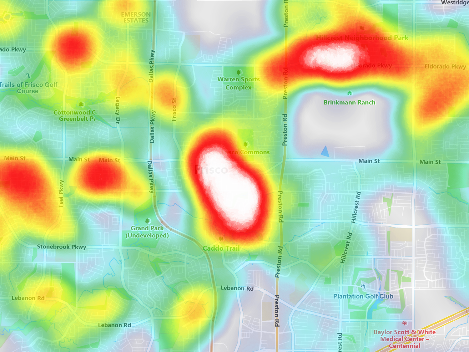
Heat Maps
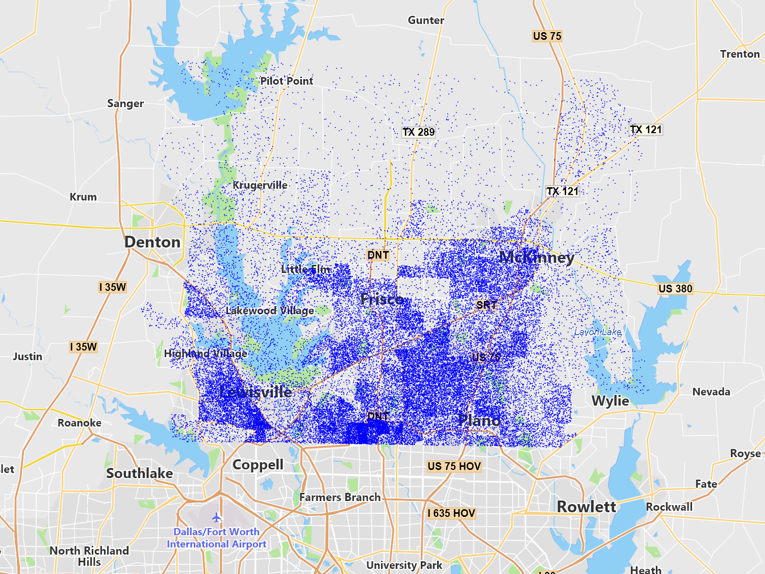
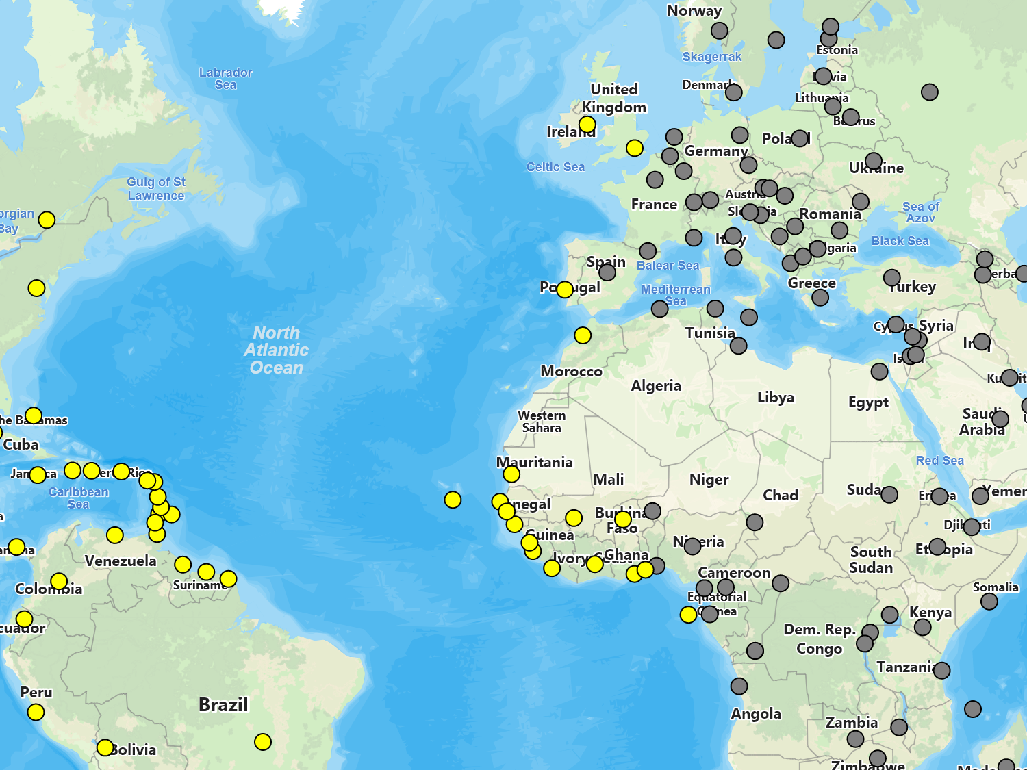
Heat maps allow you to show the intensity of your data by color. Apply this style to your point based data and choose the color spectrum and intensity ranges for your data values to quickly produce real-time heat maps your users can interact with.
Sample Code

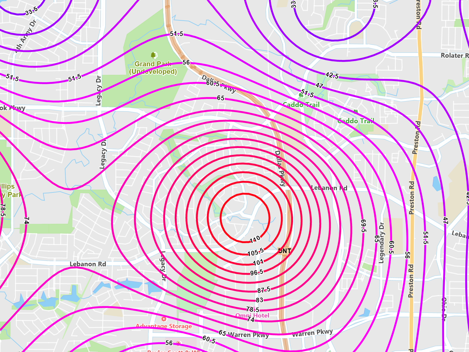
Isoline / Contour Maps
Isoline and contour maps are a great way to see relationships between a geographic area and your data. This method groups like data that are spatially connected and draws lines around the set.
Using your point data, we create a grid over the designated area and assign values to each cell based on inverse distance weighting or our other supported algorithms. This allows you to “fill in the gaps” between your point data.
Sample Code

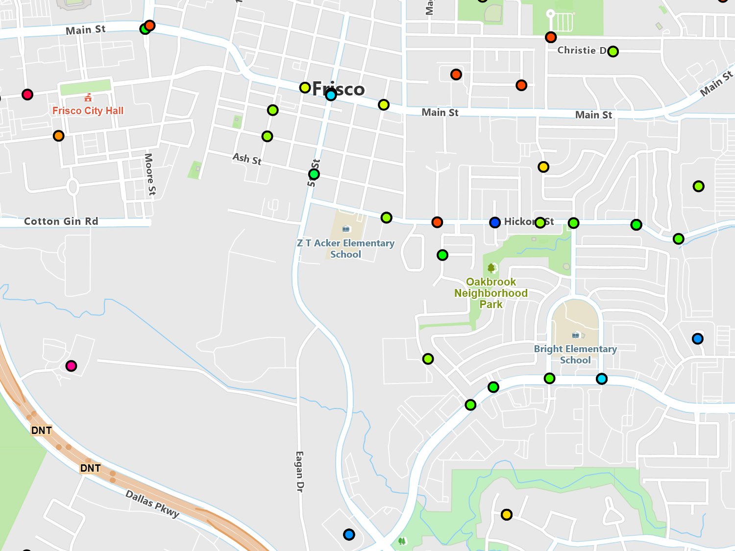
Class Break Style
Class breaks allow you to style feature differently based on ranges of values. You’re not limited to simply changing colors but you can also control every aspect of the style. So, you could have one group not display at all, while another group gets a hatch brush, and yet another using a solid color.
In this image, we styled houses that are worth $0 to $200,000 white, while houses $200,001 to $400,000 pink, and everything else above that red.
Sample Code
Value Style
With value styles, you can assign a set of styles to specific values from your data. For example, if you have a group of stores and one of the columns describes what kind of store it is (i.e. retail, restaurant), you can specify different icons for each store type and each point will display based on its value.
Styles can also be stacked. So, in the above example, not only can you display the store type but you can add an additional style which may denote if the store is currently open or closed based on another column in your data. The styles could then be moved using an offset, so that closed symbol might appear in the upper right of the store symbol or even outside of it.
Sample Code
Filter Style
A filter style can be used to render features based on different criteria in the attributes of your feature data. For example, if you have a shapefile representing different types of restaurants, you can easily render all Italian restaurants with a certain icon and all the fast food restaurants with another.
Additionally, you can apply different conditions such as Greater Than, Less Than, Equal and Not Equal to create your filter style. With the flexibility of the ThinkGeo API, you can easily add as many different filters as you like for a given feature layer.
Sample Code

Regex Style
If you need advanced pattern matching, look no further than the RegexStyle. This style allows you to use a series of regular expression statements to find matches based on columns in your data.
In the image, we applied a regular expression to a set of coyote sightings in a city. We applied a regular expression to style differently sighting that has “huge”, “big” or “large” in the text description.
Sample Code
Custom Styles
Creating your own style class or enhancing an existing one is easy. Every style has been designed to be inherited from and extended based on your specific needs. Internally, you have access to the drawing canvas, which allows you directly draw on the map using our GIS drawing primitives.
As an example, you could inherit from the PointStyle class and based on a data column, which may include store hours, could check the current time and draw an icon letting users know if the store is open or closed.
Sample Code
* Feature available, but no specific sample.